Category Archives: Printmaking part 1

Artists who use back drawing

Paul Gauguin used back drawing (trace monotype).  He spent a significant time in Tahiti and produced some emotive images from his time here.

Paul Gauguin - crouching tahitan woman

The use of shading to give shape to the back and the subtle colours used produces a simple image that has lot of feeling.

048b6c5a584eef8396cd101443b162bd

Other images have a more limited palette and, for me, are not so emotive.

Paul Klee also used back drawing.  ‘Kliener Narr in a Trance’ at first glance looks like a simple, abstract, image but when you study it you can see a face, hands and legs (a person?)

Kleiner Narr in Trance

The trace drawing method leaves random marks where ink is transferred to the paper not where the image is drawn (i.e. gives the background of the print some texture).  None of the trace drawings I have seen have ‘clean’ backgrounds.  This, in my opinion, adds to the appeal of the image.

References

https://www.pinterest.co.uk


Research point – Degas

Degas produced mono prints in addition to painting etc. after being introduced to the technique in 1870 by a friend.

In the image shown below, Degas applied a layer of paint to the glass and then removed ink to make the image.  He would remove the ink using his finger, a rag, or a sponge etc to make different marks.  This process has been called ‘dark field’.

moma_degas_threeballetdancers

He also would paint an image onto the plate and then print from that (light field).

He was very experimental, sometimes he was able to print a second, ghost, image and he would apply pastels to the ghost image to enhance it.

degas ballet dancers

My attempt at this is shown below.  I didn’t manage to vary the texture much – it is much harder than you think it would be.

IMG_0354

I have also attempted enhancing the ghost image with pastels.

IMG_0361


References

https://www.moma.org/calendar/exhibitions/1613


Project 3 – 2 coloured masked monoprints

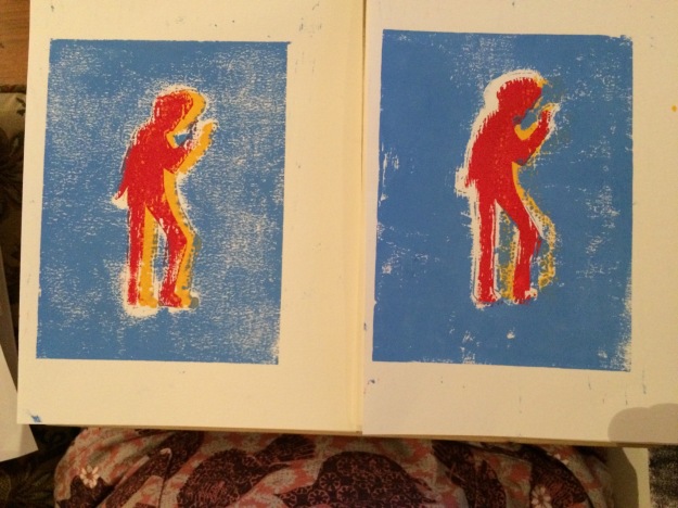
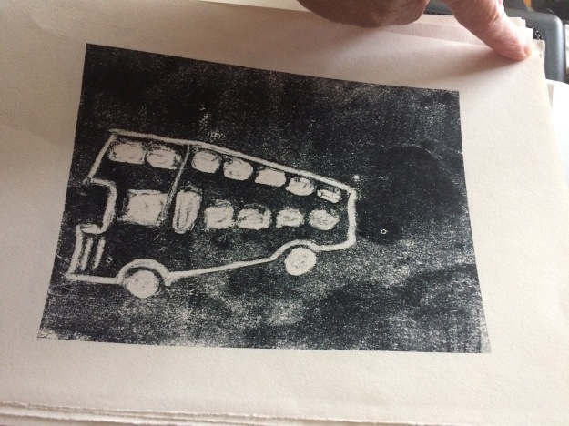
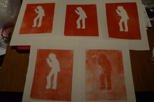
For this exercise I chose a different mask made from several, separate, pieces of paper.

I was reasonably happy with the registration but the prints showed more white space than I was expecting.  When there are fine lines you need make sure you rub the back of the paper quite carefully round the finer areas.

IMG_1118


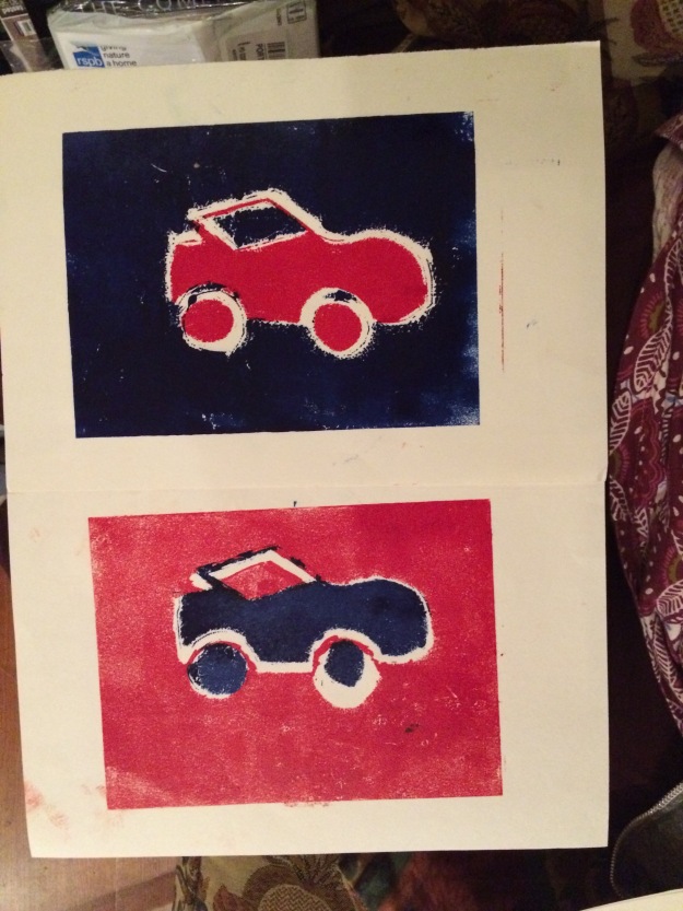
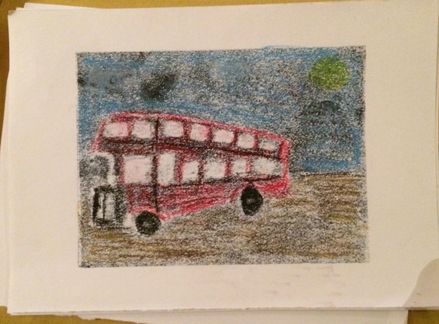
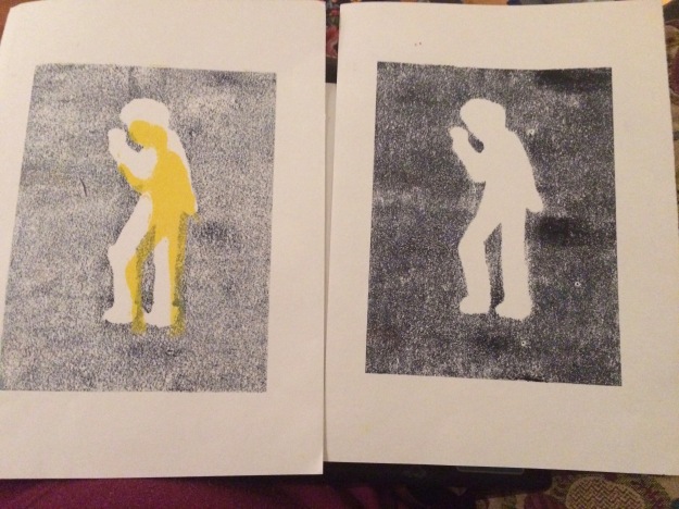
I them experimented with varying the registration, using two colours for the positive mask and offsetting them and then printing the negative mask over the top.

IMG_0343

I am pleased with the prints but less pleased with the paint marks on the border areas.

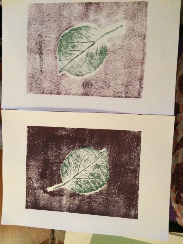
I painted onto a perspex screen and then pressed items into the paint to try and make an impression.  This wasn’t very successful in that you can’t really see the textures however, I am pleased with the fact that I managed to make two prints without getting any paint on the border areas.

IMG_0342

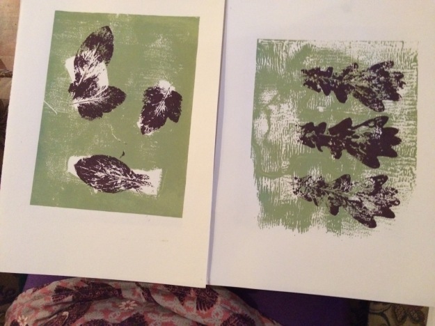
For my next experiment I printed a single colour with some masks to give some white space.

IMG_0338

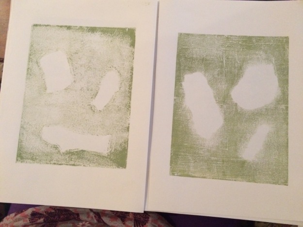
I then printed into the white areas.  I also overprinted onto a plain printed background.

IMG_0337

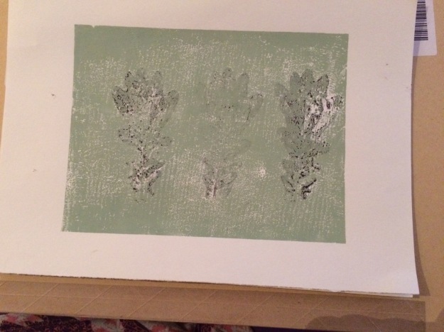
I also printed the leaves first and then overprinted with a plain colour.  I think the print may have been better if I had been a bit more patient and waited for the ink to dry fully.

IMG_0340

IMG_0336

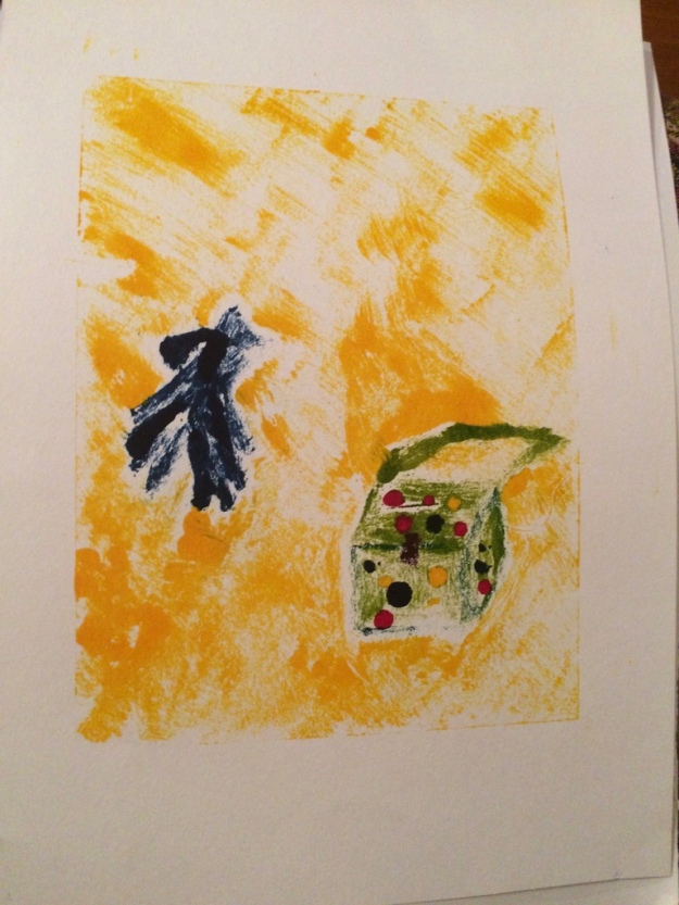
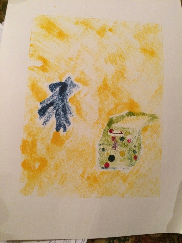
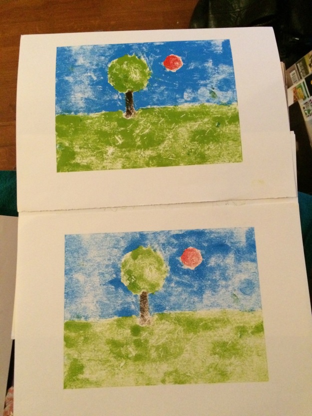
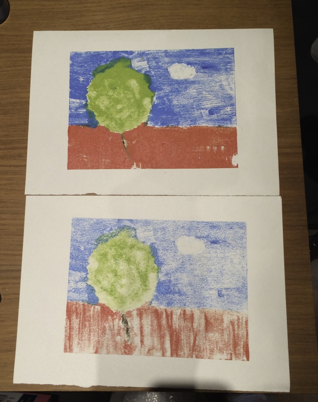
I painted a simple image onto a plate.  I pressed a leaf into the tree to try and make the texture of leaves and branches.  I rolled a straw over the foreground to try and give the impression of a cornfield.   I also used a cotton bud with a little citrus cleaner on to clear some blue ink to give the impression of a cloud.  I prefer the second print as I feel the textures show more clearly.

IMG_1122 copy


I have got some citrus brush cleaner and this can also be used to thin the paint.  I used this in the images above.  It makes the paint much easier to use.

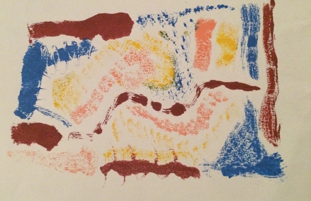
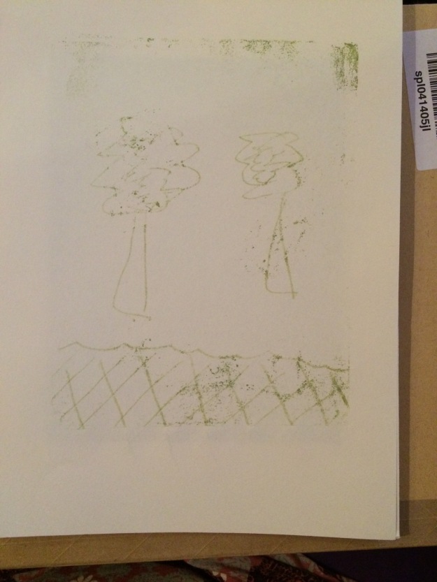
My next experiment involved back drawing.  The first attempt resulted in a print which was coloured all over.  I think the ink was too thick and I put too much pressure on the paper.

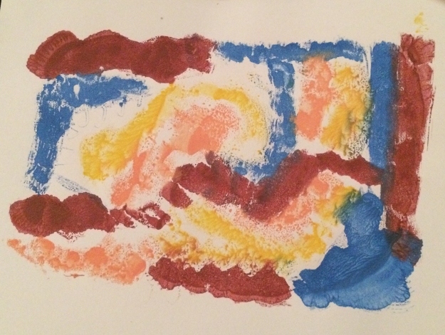
My second attempts were better.  These are shown below.  I do intend on adding further back drawing to these initial prints.

IMG_0341

IMG_0339

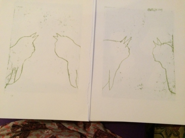
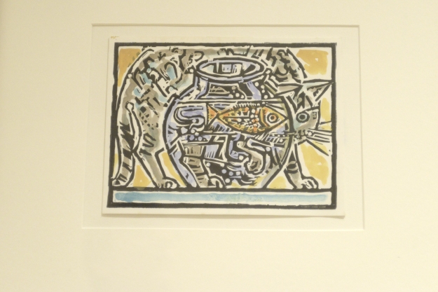
I attempted to add texture to the cats by back drawing but I had too much ink on the plate and it covered the majority of the print.IMG_1146

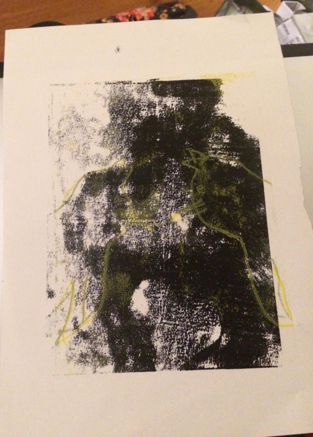
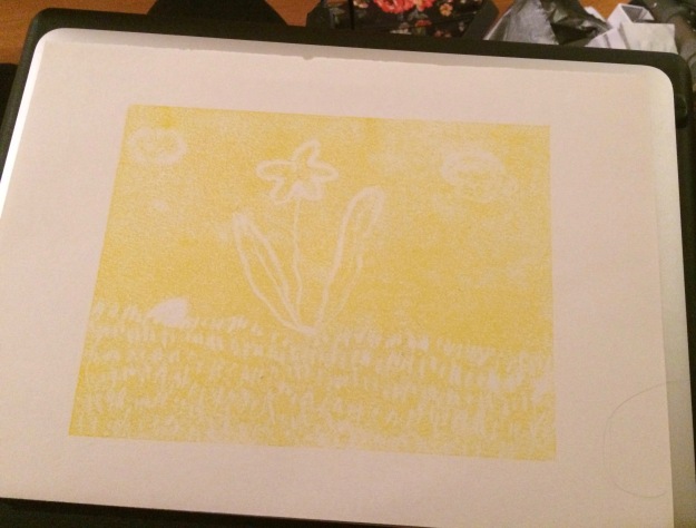
The yellow on top of the black was back drawn.

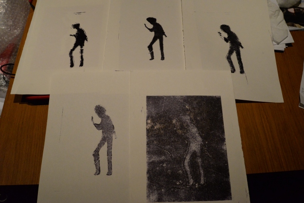
I printed additional images of ‘Bruce’

IMG_1147

The yellow and black image was made by reversing the mask and laying it on a plate inked with black.  The yellow was the residue from the mask and the black was from the plate.

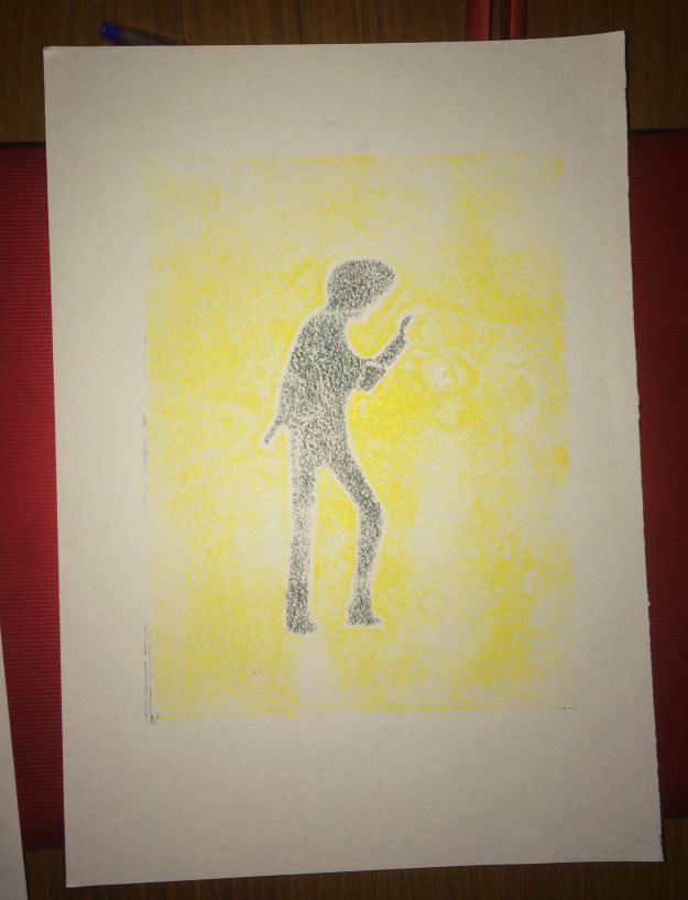
The next image was made by wiping ink from the plate using a cotton bud dipped in ‘zest it’,


IMG_1143


Positive and negative masked mono prints

I experimented with sketches of cars and planes and also of my cat but I didn’t think they would be particularly good for this project.  I was listening to the news whilst I was sketching and was saddened to hear of the death of Bruce Forsyth.  He had a particular pose he was famous for (‘the thinker’) so I sketched this.

My sketches are shown below.

IMG_1130

IMG_1126IMG_1125

I transferred the ‘Bruce’ sketch onto plain paper and cut out several templates (not as easy as I thought it would be).


I already had two colours in a tray from a previous exercise so I mixed these together and inked my plate using  the resultant colour (dark purple).  I laid the negative mask onto the plate followed by a sheet of cartridge paper.  My first image was not complete as I didn’t rub hard enough around the mask to print the image fully.  Having learnt from this, the second image was much better.  Finally, I removed the mask and took a final print from the plate.  This print is the same colour all over but where the prints have already been taken the image is shown in a lighter shade.

DSC_2708

I decided to use a complimentary colour for the negative image so I used orange.  I repeated the process above to give me another three prints.

DSC_2707.JPG

I later re-inked the plates and took some further prints using the same colours (also shown above).

I revisited this later and additional images are shown below.

IMG_1139

IMG_0358


Painted monoprint from life

I chose to print an image of my handbag and a pair of gloves.

I first sketched the image using pencil.

thumb_IMG_1003_1024I then attempted to paint the image onto perspex prior to printing.  I had previously used water based ink but found that this dried too quickly and I wasn’t able to produce an image.

My tutor had mentioned that I might find oil based ink easier to use and had recommended Hawthorn Stay Open inks so I purchased the three primary colours and tried again using this.

I didn’t reverse the page who painting on the perspex so the final print is a mirror image of my sketch.

thumb_IMG_1024_1024

I did use the whole perspex sheet this time so there is a distinct edge to the print which I prefer to my original prints.

thumb_IMG_1023_1024

There was also enough ink remaining on the perspex to produce a second print.

I was pleased with the texture of the ink on the paper, particularly the background colour.  I was also pleased with how the primary colours mixed to produce the secondary colours.

I feel the objects are quite small in relation to the overall print size. I will try to increase the object size in my next prints.

Project – 1st monoprints

I chose 3 colours and drew directly on the plate with a paintbrush.  The initial print was quite textured, it had very distinct brush-strokes.

IMG_1046


I also produced a second, ghost print.

IMG_1048

I didn’t use the full size of the plate so there wasn’t a definitive border to the image.

I felt the initial print had too much white space so I produced another print using different colours.

IMG_1049

I used water based paint so, diluted them slightly and made a couple of further prints.

I ran the end of the brush through the paint to make some marks.

IMG_1047

The texture of the paint wasn’t what I expected.  Even the diluted paint shows different patterns in the paint, not the solid colour that I anticipated.


Other students

I follow some printmaking groups on Facebook, and some other OCA student blogs online.

It is useful to see how other students set out their blogs and also what extra items they have included.  For example,

https://suesprintmakingblog.wordpress.com/2016/11/28/sketchbook-work-part-5/#more-1126

includes a separate section where images from the sketchbook have been included.

They are also a source of inspiration.  The variety of work and the skill of other students is amazing.  I hope I can produce work that is of as good a standard.

Hopes, plans and expectations

I have previously attended a two day etching course and evening classes in linocut.

I hope to extend my skills in the printmaking disciplines I have already tried and to learn new ways of producing prints.

I need to improve my drawing skills.  I am not confident to draw from life but I take a lot of photographs and intend to draw from these (at least to start with).

From my experience of other courses studied, I know I need to plan plenty of time for the essential reading and time to attend exhibitions.

Other students

I follow some printmaking groups on Facebook, and some other OCA student blogs online.

It is useful to see how other students set out their blogs and also what extra items they have included.  For example,

https://suesprintmakingblog.wordpress.com/2016/11/28/sketchbook-work-part-5/#more-1126

includes a separate section where images from the sketchbook have been included.

They are also a source of inspiration.  The variety of work and the skill of other students is amazing.  I hope I can produce work that is of as good a standard.